Colour Basics
Understanding colours and their relationships is very important in photography. Some people have a natural eye for seeing colours and blend them together well, others simply disregard the colours they see around them and do not equate them into the composition of their photographs.
One could take many classes looking at the theory of colour dynamics and relationships, but for the sake of getting down to business and taking better pictures lets look two simple aspects of colour understanding and then you can learn how to use this for taking better photos:
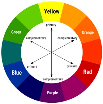
A) The colour wheel - primary colours are: red, blue and yellow. Every other colour is made up from these colours. The colours you see opposite each other on the wheel are considered "complimentary" colours and this is important to note, as this is where a photographer can use colour contrast to her/his advantage in terms of producing a "WOW" type of photo.
B) Colour Tint/Shading - By adding black and white to colours, you create shading. Having an image using one main colour and having the secondary colours a different ting/shade can produce the "WOW" effect as well - This type of contrast withing the same colour scheme, but different shading is called TONAL CONTRAST.

Those are some very, very basic ideas surrounding the colours you see around you. Now lets look at some examples, so you can appreciate the use of colour and tonal contrast before you take you next shots this week.
CREATING GREAT PHOTOS USING COLOUR CONTRAST
Many photographers know how to use contrast to benefit their photos. Contrast makes photos eye catching and can even make the most basic looking photos look great. There are two types of contrast:
Tonal contrast
Many excel at shooting photos with good tonal contrast. A good example of tonal contrast are silhouettes. The foreground is completely dark while the background is properly exposed. This works well because there is a sharp difference between the dark and light areas.

Color contrast
Color contrast is used less frequently because many people do not think about it. Capturing a photograph with good color contrast is more difficult than tonal contrast, but it is still quite easy. An image with good color contrast can look great even without any tonal contrast. In the example on the left, the image looks great even with very little tonal contrast.

What Can Good Colour Contrast Do?
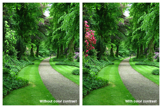
Good color contrast is a good solution when tonal contrast is hard to achieve. Even a tiny area with the opposite hue can make a large difference. Analyze the two photos below. The image on the left looks quite boring, but once we add back the colors of the red flowers, the image looks a lot more interesting.
In the image below, the color contrast is good because the colors are almost opposite of each other. The image is loud and grabs attention.

The image below has low color contrast but it still looks great because it has good tonal contrast. Also, low color contrast is not always bad. Low color contrast makes the photo quieter and well for the scenery photo below.


Comments (0)
You don't have permission to comment on this page.